I’ve been completely in love with boho colors for a while now, and I’m pretty sure it’s becoming a legitimate obsession. I’m talking dusty coral throw pillows, sage green everything, and don’t even get me started on how many mustard yellow skeins of yarn I’ve hoarded lately. My craft room is starting to look like a cozy coffee shop, and I’m not mad about it!
Today, I’m spilling all my secrets about boho colors and combinations because honestly? Once you understand this palette, your craft game will never be the same. I’m talking exact hex codes (because who has time to guess?), foolproof combinations, and all the little tricks I’ve learned from way too many late-night design sessions.
Whether you’re designing t-shirts, creating printables, or crafting seasonal décor, these colors are about to become your new best friends. Trust me on this one!
What is Boho Style?
Okay, so boho (short for bohemian) is basically everything I love about design rolled into one gorgeous, effortless style. Picture this: freedom, warmth, and creativity all having a party together. It’s cozy coffee shop vibes mixed with that friend’s house where everything somehow looks perfectly put-together without trying too hard.
Here’s the thing about boho that got me hooked: it’s forgiving. You know those design moments where you’re like, “Does this work?” With boho, the answer is usually yes because it’s built on this foundation of warm earth tones, soft neutrals, and these perfect little pops of color that just make sense together.
I love how it feels both relaxed and intentional at the same time. It’s like the style equivalent of wearing your favorite cozy sweater that happens to look amazing on you. And for us crafters who love layering textures and colors? It’s basically heaven.
The best part? Boho doesn’t demand perfection. It’s all about balance and harmony rather than matching everything exactly. You can mix a burnt orange with sage green, throw in some cream, and suddenly you’ve got this gorgeous, sophisticated look that feels effortless. It works for elegant wedding invitations just as well as it does for casual everyday crafts like shirt sublimation designs, which is probably why I keep coming back to it again and again.
The Boho Color Families That Changed My Designs
Let’s dive into the good stuff! I’m about to share the color families that literally transformed how I approach every single project. Once I understood these three groups, everything just clicked.
I remember the exact moment it happened, too. I was struggling with a fall design that felt off, and then I realized I was mixing cool tones with my warm earth colors. The second I swapped out that bright red for a warm terracotta? Magic. Pure magic.
Here’s how I break down boho colors:
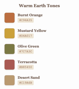
1. Warm Earth Tones
These colors are the foundation of most boho projects. They bring that cozy, grounded feel that makes everything feel like home.
- Burnt Orange:
#C96A35– Perfect for fall vibes and warm accents - Mustard Yellow:
#D4A017– Adds sunshine without being too bright - Olive Green:
#7C7A3C– Natural and sophisticated - Warm Taupe:
#A38D78– The ultimate neutral that works with everything - Creamy Beige:
#F1E6D3– Soft and versatile background color - Terracotta:
#B85450– Earthy red-orange that’s both bold and grounded - Desert Sand:
#C19A6B– Warm tan that feels like a desert sunset
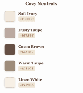
2. Cozy Neutrals
Perfect for backgrounds, layering, and balancing brighter tones. These are your go-to colors for creating calm, sophisticated bases.
- Soft Ivory:
#F3E8DC– Warmer than white, softer than cream - Dusty Taupe:
#BFA89F– The perfect greige with personality - Cocoa Brown:
#6A4E42– Rich and chocolatey without being harsh - Mushroom Gray:
#ADA291– Cool neutral with earthy undertones - Linen White:
#FAF0E6– Clean but warm, never stark
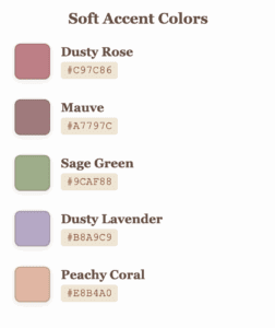
3. Soft Accent Colors
Add a touch of interest without overpowering the earthy vibe. These colors bring personality while staying true to boho’s gentle nature.
- Dusty Rose:
#C97C86– Romance meets earthiness - Mauve:
#A7797C– Sophisticated purple-pink - Blush Nude:
#E7C5C0– Barely-there pink perfection - Sage Green:
#9CAF88– Fresh herb vibes - Dusty Lavender:
#B8A9C9– Gentle purple that’s never overwhelming - Peachy Coral:
#E8B4A0– Warm and inviting
My Tried-and-True Boho Color Combinations (AKA My Secret Weapons)
Okay, this is where things get exciting! These are the exact combinations (with hex codes) I reach for when I need something that works every single time. I’ve used these palettes for everything from client projects to my own seasonal designs, and they never let me down.
Fair warning: once you start using these, you might become as obsessed as I am. Don’t say I didn’t warn you!
The Classics That Never Fail Me

Spring & Easter
- Fresh Start: Sage Green
#9CAF88+ Blush Nude#E7C5C0+ Linen White#FAF0E6+ Warm Taupe#A38D78 - Easter Garden: Dusty Lavender
#B8A9C9+ Peachy Coral#E8B4A0+ Creamy Beige#F1E6D3+ Olive Green#7C7A3C
Summer & Independence Day
- Patriotic Boho: Dusty Navy
#4A5D6A+ Terracotta#B85450+ Creamy Beige#F1E6D3+ Warm Taupe#A38D78 - Summer Sunset: Peachy Coral
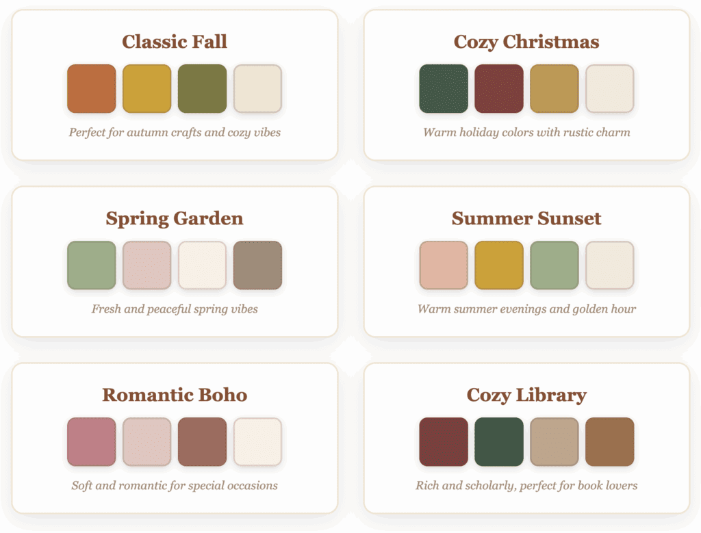
#E8B4A0+ Mustard Yellow#D4A017+ Sage Green#9CAF88+ Soft Ivory#F3E8DC
Fall & Halloween
- Classic Fall: Burnt Orange
#C96A35+ Mustard Yellow#D4A017+ Olive Green#7C7A3C+ Cream#F1E6D3 - Falloween Magic: Pumpkin Orange
#E07A35+ Golden Mustard#D1A142+ Dusty Mauve#A7797C+ Warm Ivory#F3E8DC - Harvest Moon: Terracotta
#B85450+ Desert Sand#C19A6B+ Cocoa Brown#6A4E42+ Mushroom Gray#ADA291
Thanksgiving
- Grateful Gathering: Russet Brown
#8C4B2E+ Burnt Sienna#B65D3A+ Golden Maize#E0A64D+ Olive Green#75724A - Autumn Abundance: Burnt Orange
#C96A35+ Warm Taupe#A38D78+ Mustard Yellow#D4A017+ Linen White#FAF0E6
Christmas & Winter
- Cozy Christmas: Deep Pine
#3F5B47+ Brick Red#8B3A3A+ Golden Ochre#C4974B+ Warm Cream#F4E9DD - Winter Wonderland: Dusty Navy
#4A5D6A+ Soft Ivory#F3E8DC+ Dusty Taupe#BFA89F+ Sage Green#9CAF88 - Rustic Holiday: Forest Green
#395444+ Dusty Rose#C97C86+ Desert Sand#C19A6B+ Cocoa Brown#6A4E42
Valentine’s Day
- Romantic Boho: Dusty Rose
#C97C86+ Blush Nude#E7C5C0+ Warm Clay#A56A5E+ Linen White#FAF0E6 - Love Story: Mauve
#A7797C+ Peachy Coral#E8B4A0+ Creamy Beige#F1E6D3+ Dusty Taupe#BFA89F
St. Patrick’s Day
- Lucky Charm: Sage Green
#9CAF88+ Desert Sand#C19A6B+ Soft Ivory#F3E8DC+ Warm Taupe#A38D78 - Irish Countryside: Olive Green
#7C7A3C+ Creamy Beige#F1E6D3+ Dusty Lavender#B8A9C9+ Cocoa Brown#6A4E42
Mother’s Day & Special Occasions
- Mom’s Garden: Dusty Lavender
#B8A9C9+ Sage Green#9CAF88+ Blush Nude#E7C5C0+ Linen White#FAF0E6 - Timeless Love: Mauve
#A7797C+ Warm Taupe#A38D78+ Soft Ivory#F3E8DC+ Desert Sand#C19A6B
Back to School & Study Vibes
- Cozy Library: Vintage Burgundy
#803D3B+ Forest Green#395444+ Dusty Tan#C2A68B+ Warm Caramel#A37048 - Student Life: Cocoa Brown
#6A4E42+ Mustard Yellow#D4A017+ Sage Green#9CAF88+ Creamy Beige#F1E6D3
Awareness & Cause Colors
- Breast Cancer Awareness: Dusty Rose
#C97C86+ Blush Nude#E7C5C0+ Warm Clay#A56A5E+ Sage Green#9CAF88 - Mental Health Awareness: Dusty Lavender
#B8A9C9+ Sage Green#9CAF88+ Soft Ivory#F3E8DC+ Warm Taupe#A38D78
Everything I’ve Learned About Using Boho Colors (The Hard-Won Wisdom)
I’ve made plenty of mistakes when it comes to color combinations. I’ve created designs that looked gorgeous on screen but terrible on certain blanks. A time or two, I’ve mixed too many colors and created chaos instead of harmony. I’ve ignored lighting and wondered why my “perfect” colors looked completely wrong in real life.
But here’s what I’ve figured out after countless projects:
1. Layer Like You Mean It
This was a game-changer for me. Boho isn’t about slapping down flat colors; it’s about creating that rich, lived-in depth that makes people want to touch your designs. I use the 60-30-10 rule religiously now: 60% of my neutral base, 30% of a secondary earth tone, and 10% of a gorgeous accent color. Works every time.
2. Pattern Mixing is an Art (But There’s a Method)
I used to be terrified of mixing patterns until I learned this secret: keep your patterns in similar scales. Small florals with tiny polka dots? Beautiful. Large florals with delicate stripes? Perfect. Large florals with big polka dots? That’s where things get chaotic.
3. Always Start with Your Neutrals
This might be the most important lesson I’ve learned. I always, always start with my earthtone foundation first, then add the fun stuff. It keeps me grounded (literally and figuratively) and ensures my designs never feel overwhelming.
4. The Magic Number is Real
Three to four colors maximum, friends. I know it’s tempting to use ALL the beautiful boho colors, but trust me, restraint is your friend here. When I stick to three colors, magic happens. When I use five or six, things get messy fast.
5. Test Everything in Context
I cannot stress this enough: always mock up your design on the actual product. That gorgeous sage green might look perfect on your screen, but completely different on a black canvas tote bag. Save yourself the heartache and test on accurate mockups first!
6. Lighting Changes Everything
Here’s something I wish someone had told me earlier: boho colors can look completely different under various lighting. That warm terracotta might look muddy under fluorescent lights, but gorgeous in natural light. If you’re selling physical products, test your colors in different lighting situations. Your customers will thank you.
7. Material Matters More Than You Think
Different materials and finishes completely change how colors appear. Matte finishes make boho colors look more organic and earthy (which I love), while glossy finishes can make them appear more vibrant. Neither is wrong, but knowing this helps you make intentional choices instead of accidental ones.
Creating Seasonal Collections with Boho Colors
One of the best strategies for craft businesses is creating cohesive seasonal collections using boho palettes. Here’s how to approach each season:
Spring Collections
Focus on renewal and growth with sage greens, soft lavenders, and peachy corals paired with your neutral base.
Summer Collections
Embrace warmth with terracotta, dusty corals, and golden tones that feel like sunset beach vibes.
Fall Collections
Go deeper with burnt oranges, mustard yellows, and rich browns that capture that cozy autumn feeling.
Winter Collections
Create warmth during cold months with deep forest greens, warm burgundies, and golden ochres.
The Bottom Line
Boho style has completely transformed how I approach color in my crafts, and I honestly can’t imagine going back to my old “safe” color combinations. These warm, earthy palettes work beautifully for absolutely everything… from nursery décor and wedding invitations to seasonal t-shirts and planner stickers.
The best part? Once you start working with these colors, you’ll develop this intuitive sense of what works together. It’s like learning a new language, and suddenly you’re fluent in cozy, sophisticated design.
Start with one palette that makes your heart happy, play around with it, and watch how it changes your entire creative approach. I have a feeling you’re going to fall in love with boho colors just like I did.
💡 Before You Go: Bookmark this post because you’re going to want to come back to these combinations again and again. And seriously, keep those hex codes handy, they’re your shortcut to creating that perfectly sophisticated boho look that your customers (and your Instagram feed) will absolutely love!

